02 / Case Study · Concept
Settle. Relocation & travel partner.
A personal relocation assistant that turns the chaos of moving to a new country into a clear, guided and manageable process.
- Role
- Product Designer (UI/UX)
- Duration
- 8-week design sprint
- Platform
- Mobile · iOS + Android
01
Project Overview
Problem — International relocation is rarely a seamless transition. It's a complex web of hundreds of fragmented tasks.
Role — I led an 8-week end-to-end design sprint to create Settle, a mobile relocation partner. Grounded in comprehensive user research, the app bridges the gap between travel and residency, organising the chaos of moving into a clear, manageable roadmap that prioritises the user's peace of mind.
Jump to hi-fi designs02
Relocation Market
Migration is no longer a niche event; it is a global mega-trend. The 2024 UN World Migration Report counts ~281 million international migrants globally — double 1990. The OECD reports that over 6 million people move permanently to developed countries every year, excluding students and digital nomads.
International migrants globally (UN 2024)
People move to OECD countries every year
Move for economic opportunity
Move for education
03
User Research
The research phase was driven by three objectives: understand relocation challenges, identify time-sensitive tasks, and learn how people currently organise moves.
Qualitative
Four in-depth user interviews to learn about pain points, needs and expectations around relocation.
Quantitative
A survey gathered insights on feature prioritisation, helping us find the common segment and validate our hypotheses.
04
Competitive Analysis
Existing solutions focus on isolated problems — none offer a unified, user-centric journey.
Relocation services
Deel, LocalyzeWins
- Handle bureaucracy end-to-end
Gaps
- B2B focused, not for individuals
Productivity tools
Notion, TodoistWins
- Flexible task management
Gaps
- Generic — no relocation context
Community platforms
Reddit, Facebook GroupsWins
- Real people, real answers
Gaps
- Scattered, advice hard to trust
Document storage
Drive, DropboxWins
- Reliable file storage
Gaps
- No guidance on what's required
05
Key Insights & Opportunities
The Verification Loop
70% of users waste 5+ hours a week cross-referencing data, lacking a 24/7 support system to validate their findings.
Task Sequencing
Users fail to identify which tasks block others (‘I need a bank account to rent, but an address to bank’), leading to operational deadlocks.
Asset Management
Critical documents (visas, deeds, contracts) are often disorganised, causing panic during high-stakes appointments.
Social Displacement
Beyond logistics, users struggle with the ‘soft’ challenges of relocation — loneliness and the lack of a local support network.
06
The Solution
Empathising with the user's problems, I distilled the research into a set of major product requirements that shape the overall experience.
- 01Automatically generate a comprehensive relocation task list with clear timelines, allowing users to edit, delete, and track progress in real-time.
- 02Let users upload required documents, reviewed internally, with anything missing clearly flagged.
- 0324×7 support system with an intuitive path to reach help.
- 04Community features — local events and discussion hubs — to help users feel ‘at home’ even before they arrive.
07
User Persona · Primary user

- Name
- Priya Sharma
- Age
- 27
- Role
- Software Engineer
- Device
- Mobile-first, expects quick, clear actions
- Context
- Moving from Bangalore, India → Berlin, Germany for a full-time job
Behaviours
- Researches heavily but gets overwhelmed quickly.
- Saves links, screenshots and PDFs across devices.
- Relies on WhatsApp groups, Reddit and friends for reassurance.
- Checks tasks multiple times due to fear of mistakes.
Feelings
- Excited about career growth and living abroad.
- Anxious, uncertain, mentally overloaded.
- Wants reassurance that she's ‘doing things right’.
Goals
- Complete all relocation tasks correctly and on time.
- Avoid fines, legal trouble or missing mandatory steps.
- Feel in control instead of anxious during the move.
- Settle into life in Germany as quickly as possible.
Pain Points
- Doesn't know what to do first.
- Overwhelmed by German bureaucracy and unfamiliar terminology.
- Information fragmented across blogs, expat forums and government sites.
- Afraid of missing time-sensitive legal steps.
- Unsure which documents are critical vs. optional.
08
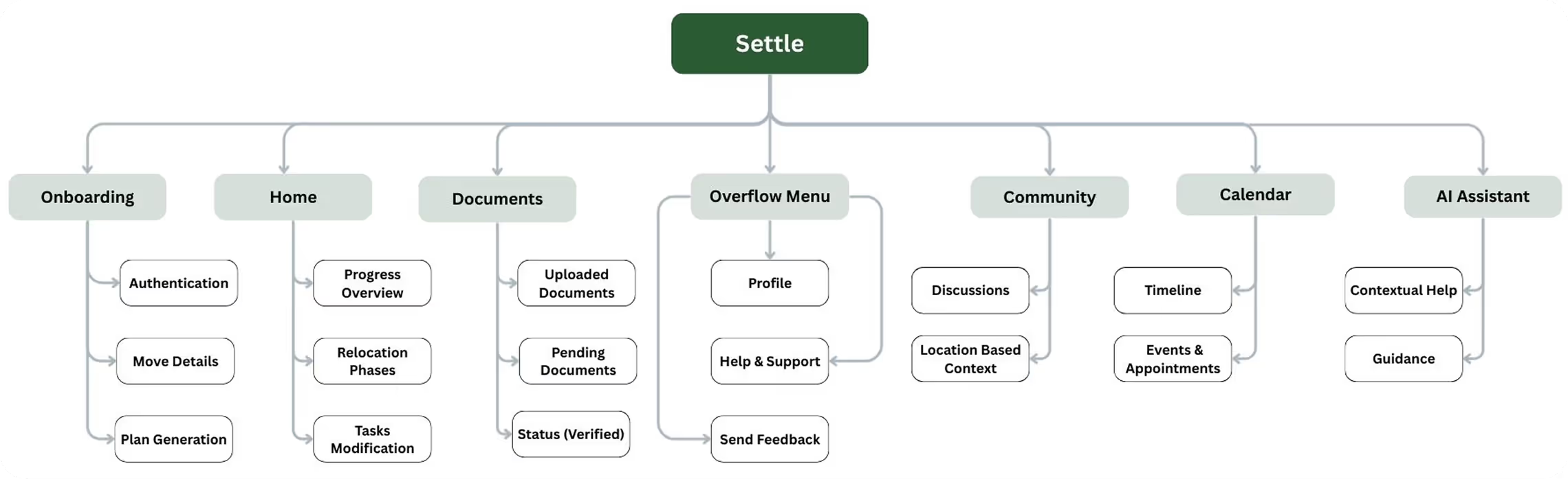
Information Architecture
09
Design & Prototyping
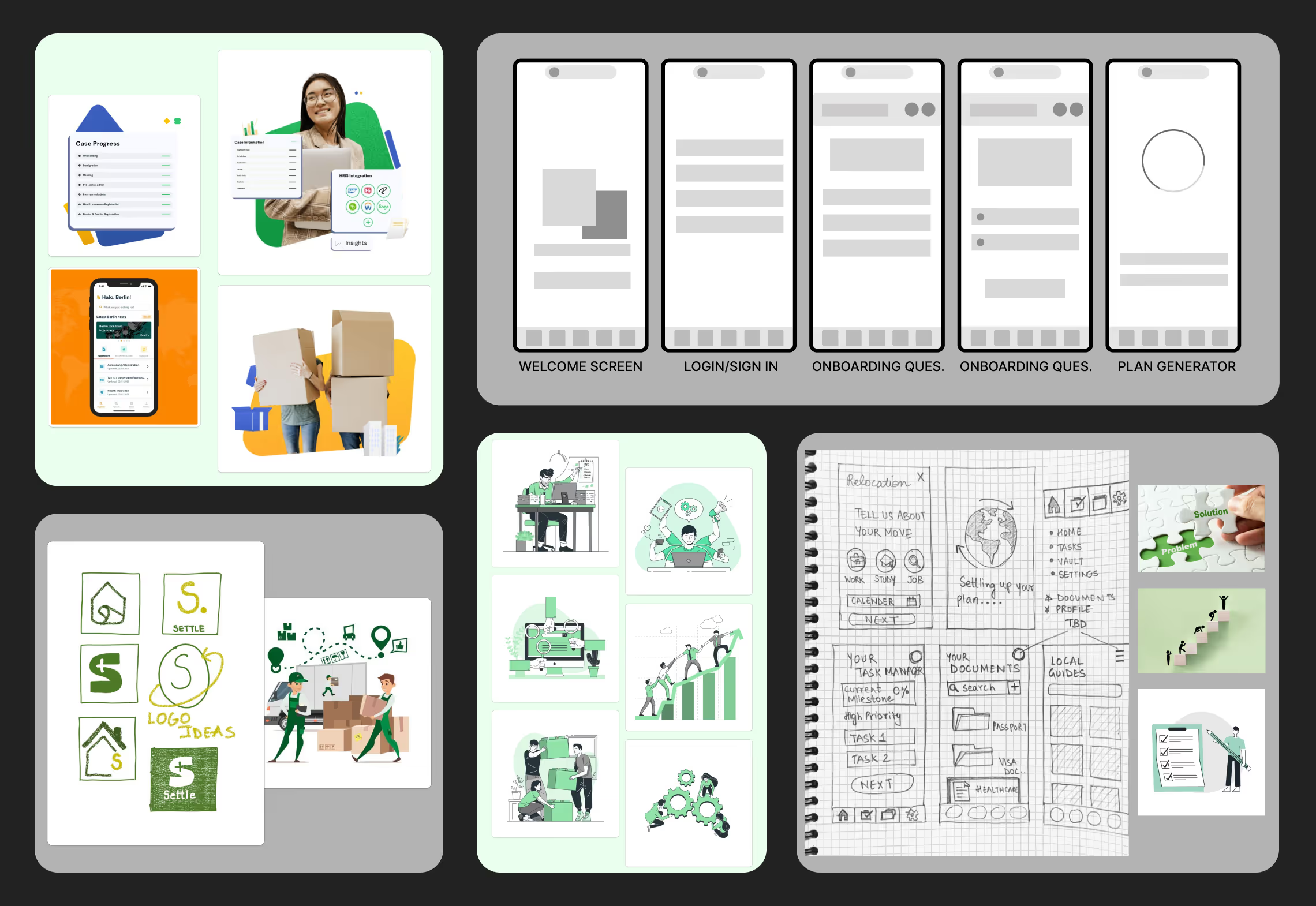
Lo-Fi Ideation
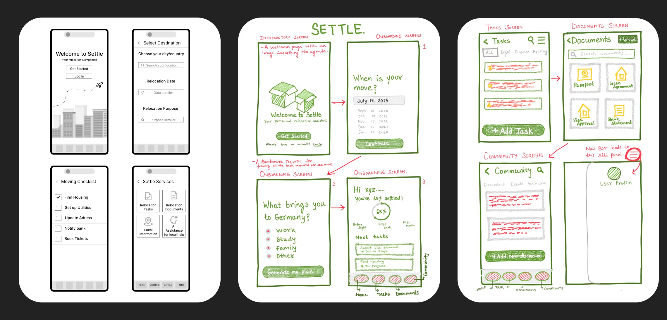
The lo-fi ideation phase focused on defining a structure that reduces cognitive load during the stressful relocation process. A milestone-based architecture breaks down an international move into bite-sized steps before moving into hi-fi.
Lo-Fi Designs
Mood-board

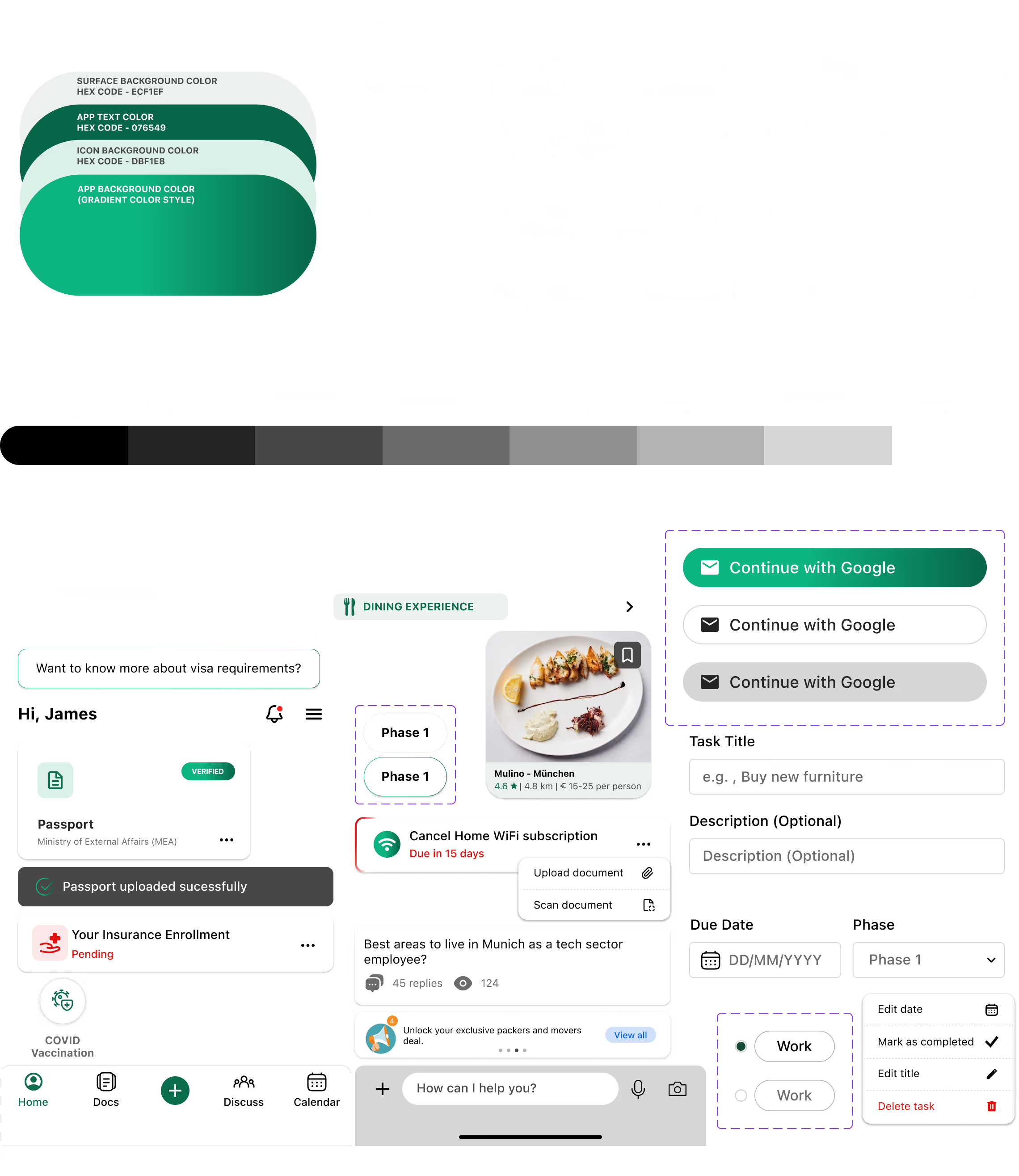
I chose a cohesive palette of ombre and layered greens — from deep forest to light sage — to transform the ‘red-alert' chaos of relocation into a guided journey of growth and stability, moving away from the clinical feel of a standard checklist toward the natural transition of ‘planting roots' in a new home.
Design System & Hi-Fi Designs
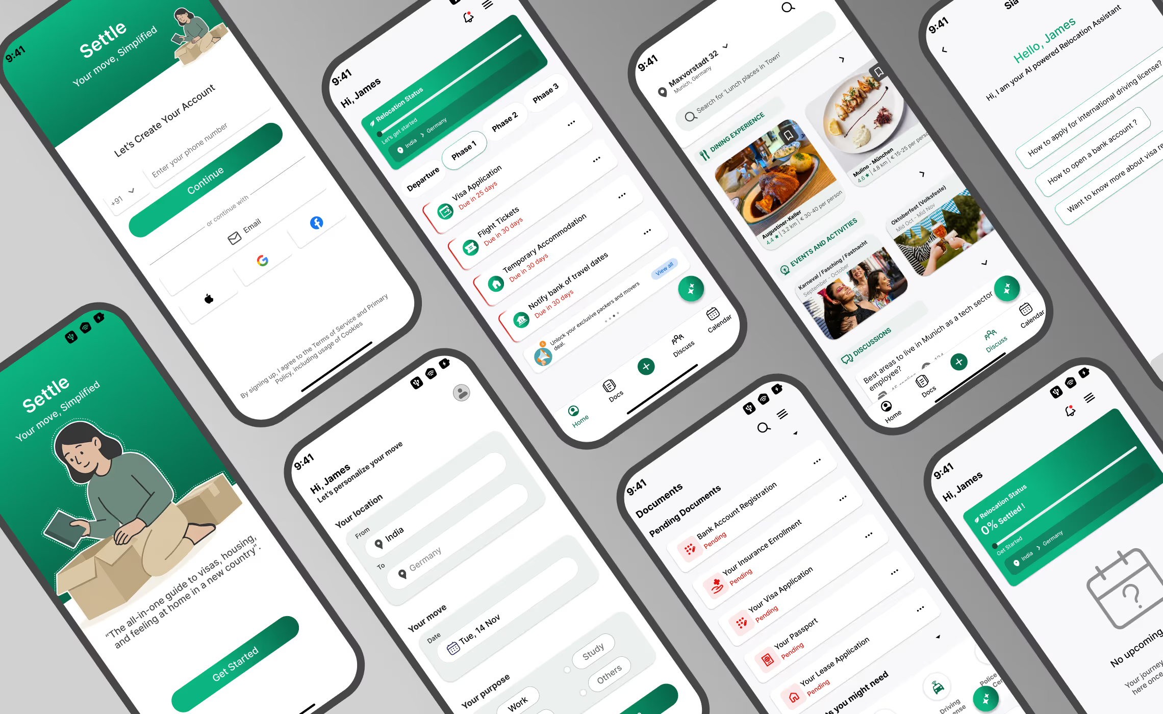
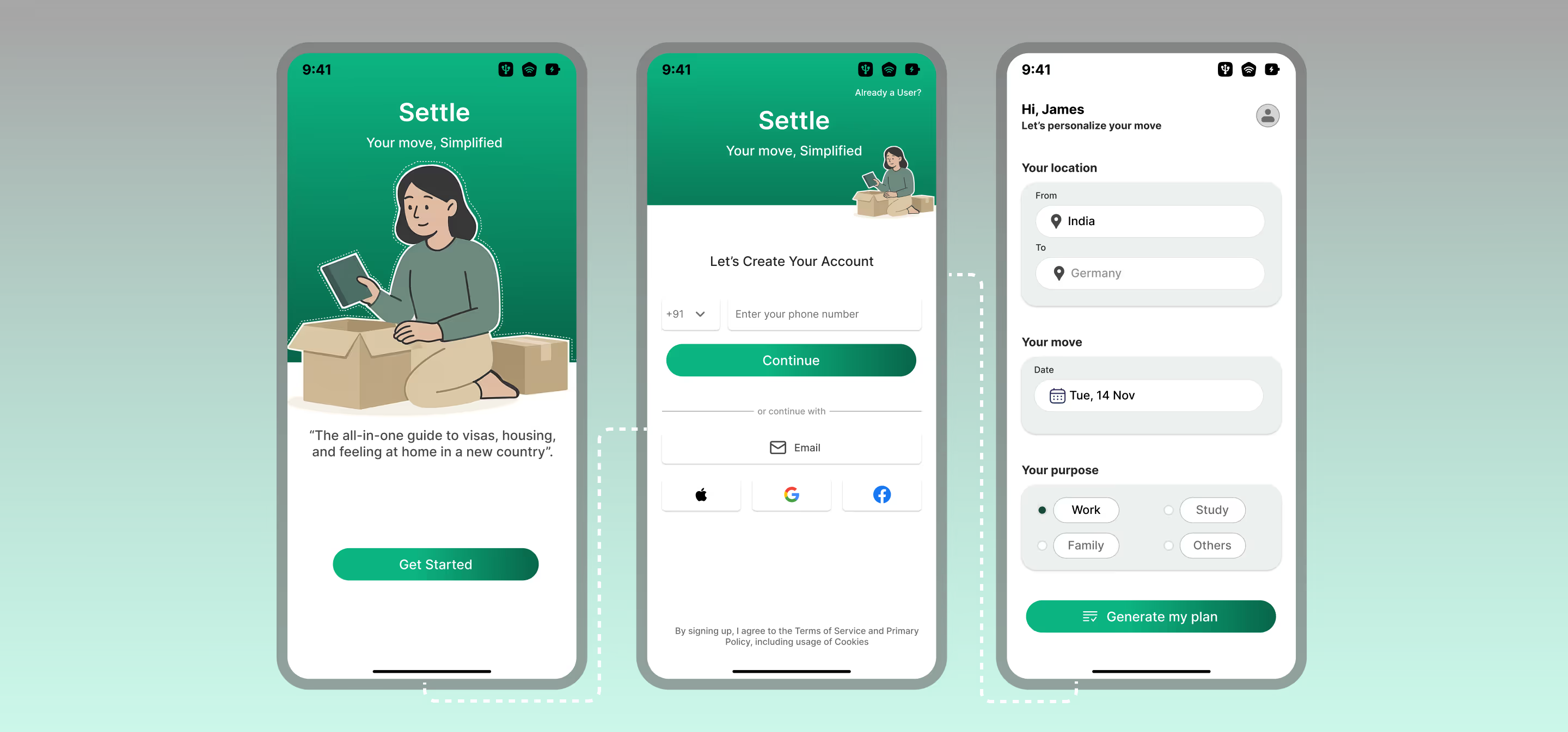
Easy Onboarding
The sign-up is frictionless — email or phone. Immediately after, users complete a targeted questionnaire to capture essential move details, which is instantly processed into a personalised relocation roadmap.
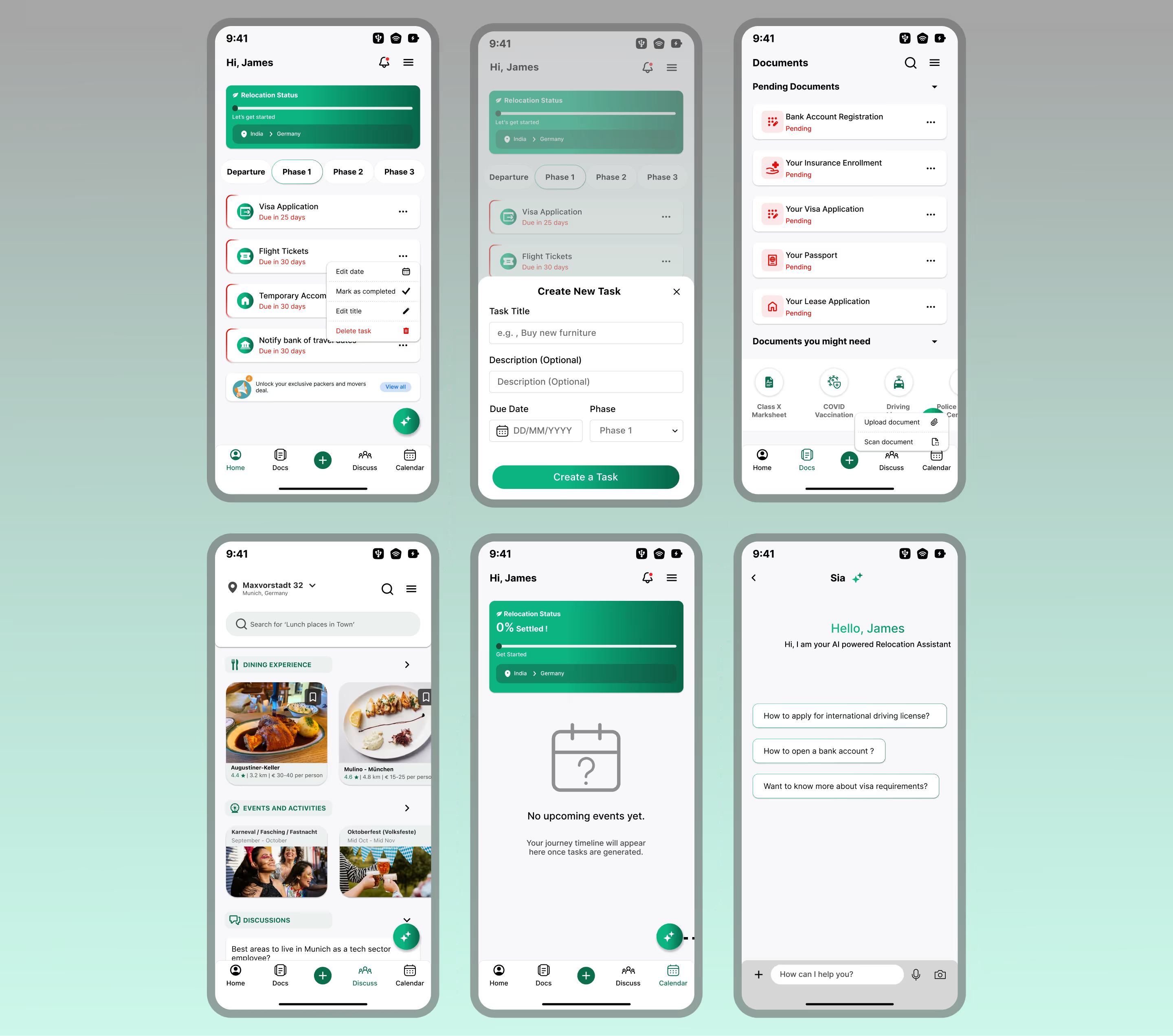
The App Experience
The roadmap is divided into logical phases. Users see only immediate, actionable items rather than a daunting long list, with the flexibility to add or edit tasks. A dedicated, encrypted hub stores sensitive paperwork; a Community Hub connects users with peers; and an integrated Calendar keeps everyone aligned with the move date.
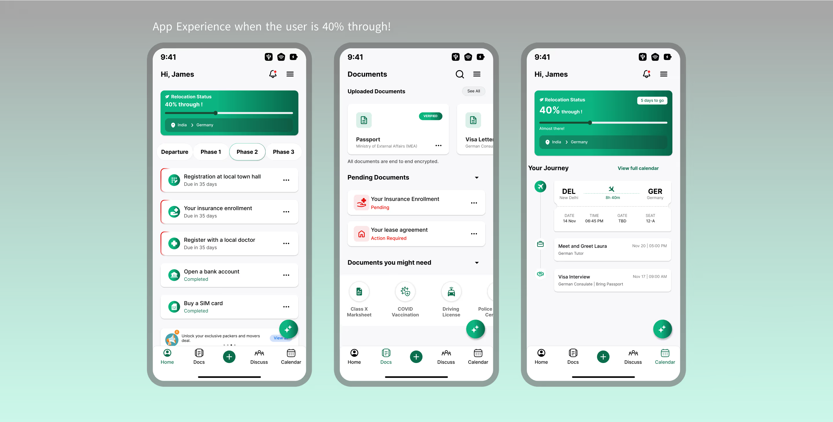
The UX through the journey
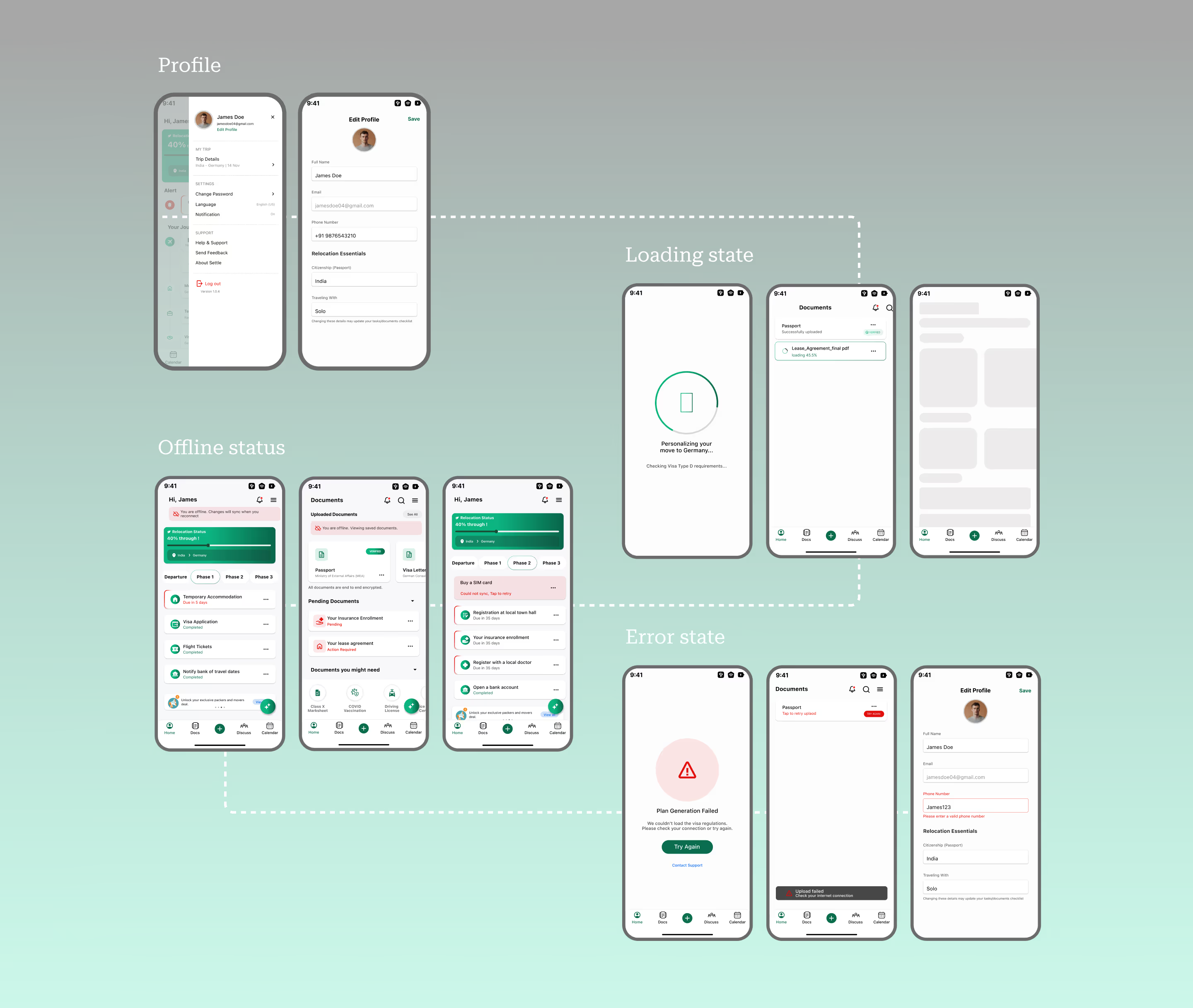
Feedback & Error states
10
Accessibility Considerations
Cognitive & Visual
Primary brand palette maintains a 3.7:1 contrast ratio, meeting WCAG for large text and graphical components. High-legibility sans-serif fonts with generous line spacing reduce visual noise during high-stress relocation tasks.
Interactive & Motor
All interactive elements maintain a minimum 44×44 dp touch target. Error states provide explicit fixes, reducing frustration for users with motor or cognitive impairments.
Assistive Technology
Clear semantic hierarchy so screen readers can phrase the roadmap by milestones. Progress bars and document icons include descriptive labels (e.g. ‘Relocation 40% Complete’).
Linguistic & Inclusive
Complex legal terms translated into simple, actionable language. Integrated AI assistant (Sia) provides immediate, simplified explanations of difficult document requirements.
11
Prototype
Explore the interactive prototype to see how the relocation journey feels in action — from onboarding to the first completed task.
Open prototype12
Key Takeaways
- 01Designing for journeys is more effective than designing for features — structuring the product around user progress and mental models made the experience feel personal.
- 02Information architecture plays a critical role in reducing anxiety. A well-thought-out IA reassures users of what to focus on now and what can wait.
- 03Contextual visibility improves decision-making. Surfacing tasks, documents and guidance based on the user's current phase kept things intentional rather than overwhelming.
- 04Support systems are as important as functional tools — community and AI provide the emotional layer that checklists cannot.
- 05Simplification is a design skill. Distilling a complex system into a clear IA — without losing depth — was the hardest and most valuable part.