01 / Case Study · Live Product
Disha. India's first AI Health Coach.
A personal AI health coach, for your personalized health guidance, anytime, anywhere. Now available on the App Store and Play Store.
- Role
- Product Designer (UI/UX)
- Duration
- ~2.5 years
- Platform
- iOS · Android
01
Project Overview
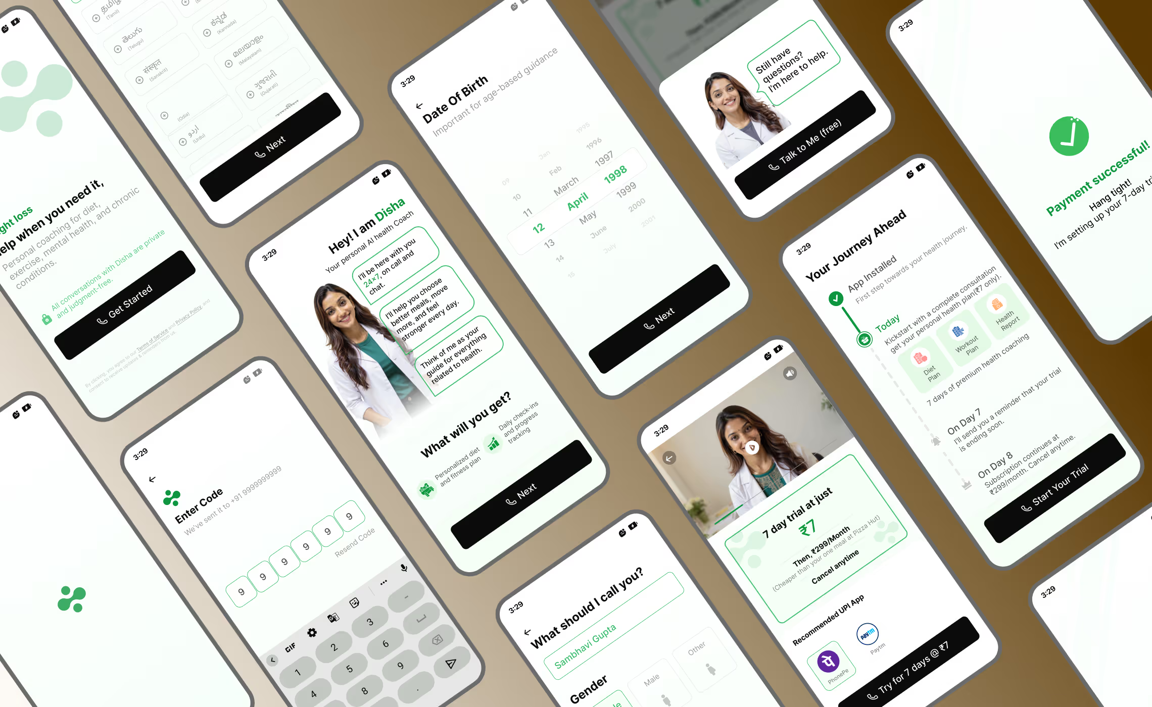
Your personalized health guidance, anytime, anywhere. Unlike traditional apps that simply log numbers, we designed a conversational platform that acts as a proactive partner. It mirrors the interaction of a human health expert, understanding your personal context to deliver tailored advice and empathetic coaching exactly when you need it most.
Jump to hi-fi designs02
My Role
From the inception to the launch I played the role of a Product Designer (UI/UX). I was in charge of conducting comprehensive user research, making designs for end-to-end onboarding flow, push notifications, and marketing website design.
03
Impact
Contributed to Disha trending in the Top 10 Free Apps on the Google Play Store (India). Optimised onboarding conversion, helping the app cross 200K+ downloads in under two quarters. Notification loops grew DAU and drove revenue.
Free Apps on Google Play (India)
Downloads in under two quarters
Onboarding conversion after iteration
Sign-up → Trial lift from A/B test
04
Problems & Challenges
Problem
Most people want to live healthy but don't know how to do it consistently. Health info on Google, YouTube and Instagram is generic, confusing and often contradictory.
- What diet actually works for their body
- How to balance food, fitness and daily habits
- How to stay consistent beyond a few days or weeks
Challenge 1
Traditional solutions don't solve this because:
- Human nutritionists and trainers are expensive, time-bound and inaccessible
- Fitness and diet apps provide static plans that don't adapt to real life
- Most apps focus on tracking, not guiding
Challenge 2
Overwhelmed by conflicting information, many users:
- Start health journeys but quit early
- Follow extreme or unsustainable plans
- Feel overwhelmed, judged or unsupported
- Lack a trusted, continuous health companion
05
Competitive Analysis
I audited top competitors to understand existing mental models and identified where the user experience breaks down — uncovering a major opportunity for a more conversational interface, and finding valuable inspiration in existing onboarding flows.
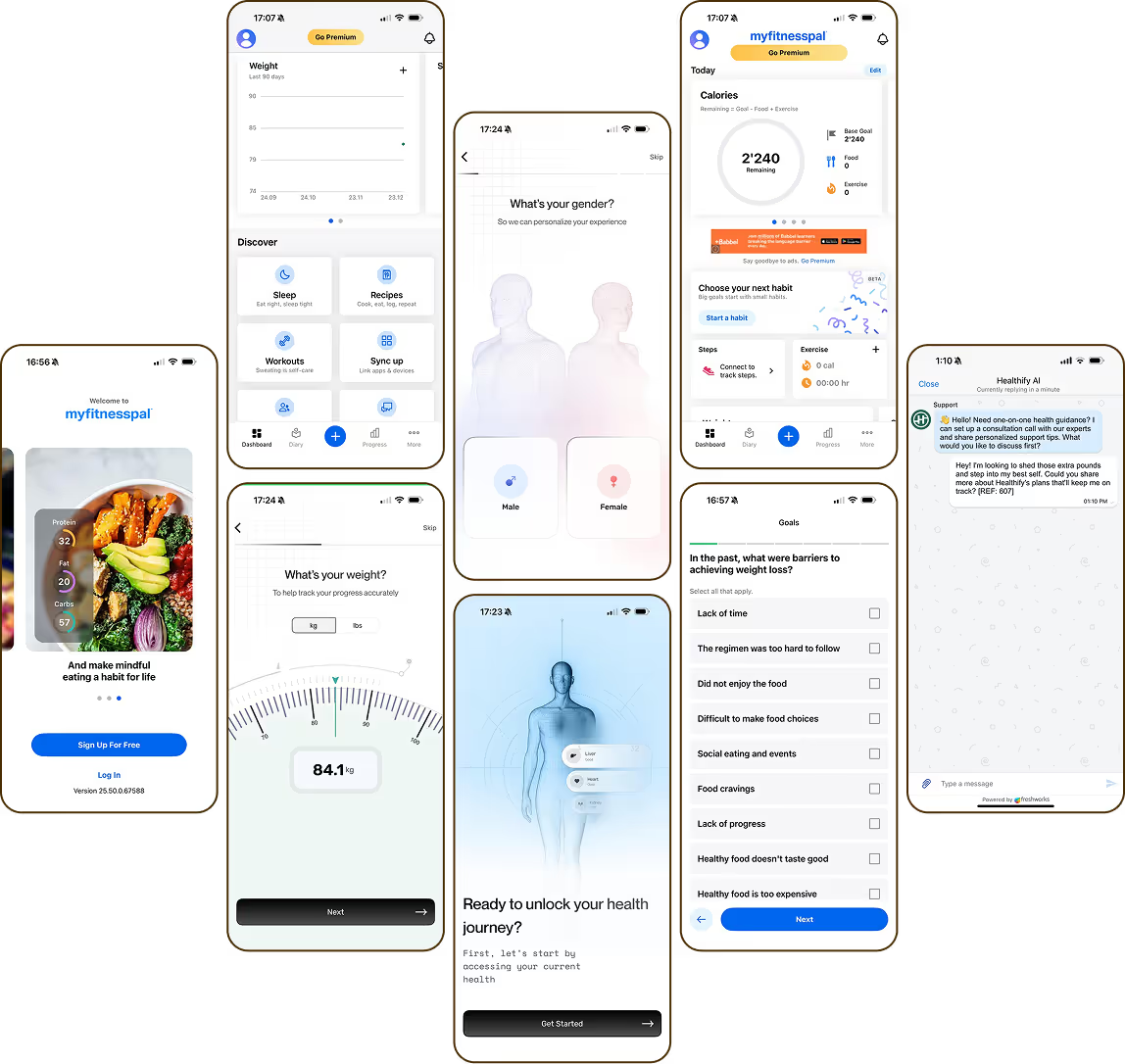
HealthifyMe
Calorie tracking & plansWhat works
- Onboarding screens
- Simple timeline login
- AI FAB ‘Ria'
Gaps
- ‘Ria' lacks real-time flow
- Human coaching is expensive
MyFitness
Nutrition databaseWhat works
- Massive food database
- Clear value proposition
Gaps
- No AI guidance
- Data-heavy home
- Ad-heavy free tier
Fittr
Community & transformationWhat works
- Great onboarding visuals
- Sliders for height/weight
Gaps
- Fragmented coaching
- Cluttered home
Cult.Fit
Workout classesWhat works
- High-quality video
- Variety of formats
Gaps
- Focuses only on the workout hour
- No integrated chat
Noom
Weight lossWhat works
- Engaging lessons over dieting
- Green/Yellow/Red food system
Gaps
- Coaches feel scripted
- Difficult cancellation flow
Leap Health
Home workouts (no equipment)What works
- Low barrier
- Animated guides
- ‘30-Day Challenge' gamification
Gaps
- Lack of personalization
- Ad intrusion
- Cookie-cutter plans
06
User Research
We conducted comprehensive user interviews to understand the challenges users face in accessing personalised diet and wellness guidance in India, and to explore how AI can make healthcare more affordable, accessible and scalable.
%202.avif)
07
Key Insights & Solution
The Vision: a proactive health partner
Move away from stressful apps that focus on past mistakes and replace them with a coach that guides you through the next hour — a conversational flow where the AI feels natural, like an expert health coach.
Focus on the Future
Instead of scary red charts about what you did wrong, the app tells you exactly what to do next to stay on track.
Easy Data Entry
No more manual typing. Take a photo of your meal or speak to the app to log your day instantly.
Always Available
A voice-based companion you can talk to anytime — it feels like a real person, not just a chat screen.
Kind & Private Coaching
A judgment-free zone. Compassionate advice and privacy — a supportive friend on your bad days.
Professional & Affordable
The same high-quality advice as an expensive human expert, at a much more affordable price.
Personalized to You
Listens to your schedule and life, giving you a custom plan that fits your day perfectly.
08
Who this is for
Designed for novice internet users less familiar with complex digital interfaces — mainly in Tier 2 and Tier 3 cities, aged 30–50. It prioritises simplicity, clarity and ease of use, while remaining accessible and affordable for middle and lower income backgrounds.
09
User Persona · Primary user
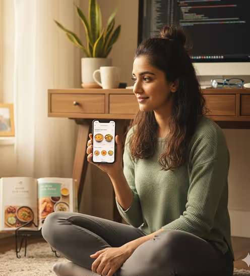
- Name
- Sambhavi Gupta
- Age
- 27
- Location
- Semi-Urban India
- Vitals
- 5'8”, 78 kg
Core pain points
- Information overload: confused by conflicting advice on social media.
- Cultural gap: global apps suggest ‘avocado toast' or ‘kale' — expensive or unavailable locally.
- Motivation slumps: starts strong on Mondays but loses steam by Thursday.
Goals & motivation
- Sustainable weight loss: wants to lose 5–7 kg without crash dieting.
- Consistency: needs a routine that fits a 9-to-6 sedentary job.
- Clear guidance: wants to know exactly what to eat from an Indian kitchen.
10
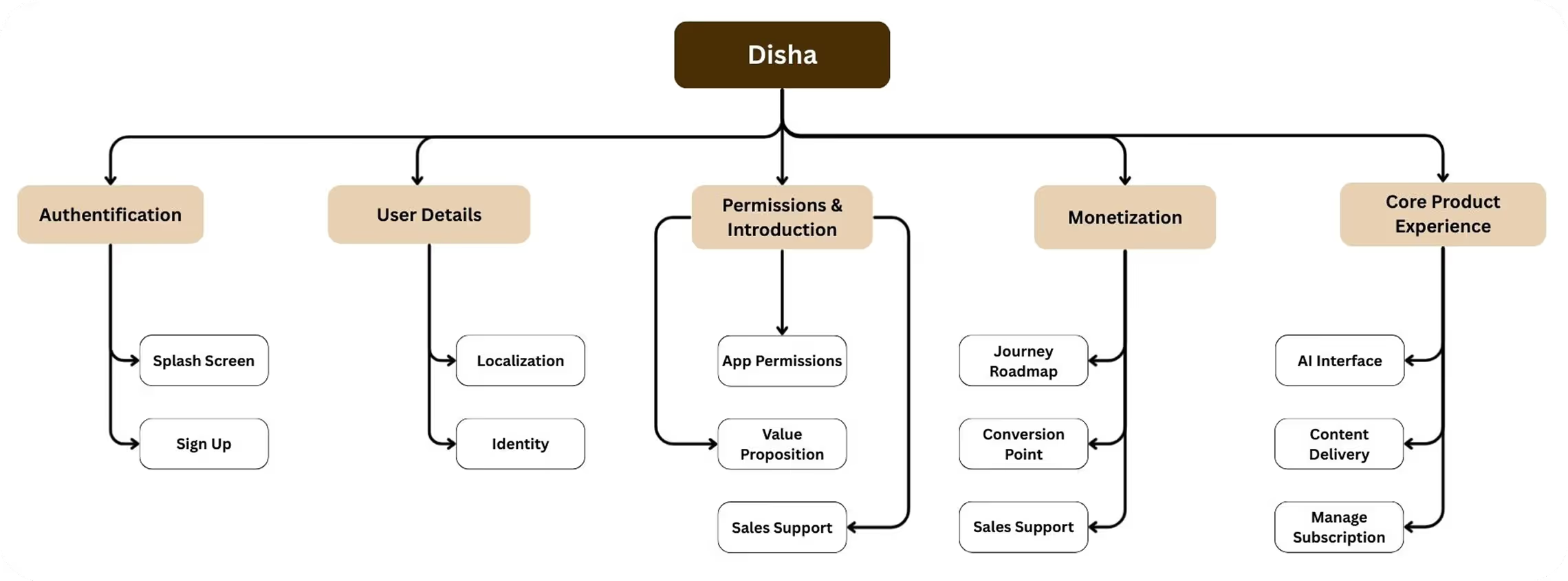
Information Architecture
The Information Architecture of Disha is a linear, conversion-focused funnel designed to minimize drop-offs. It starts with a Data Intake Layer (OTP login and vital collection: age, weight, and health goals), creating a personalized clinical profile. This leads into a Decision Layer, where a visual roadmap and a low-friction ₹7 paywall convert users. Post-payment, the IA shifts to a Chat-First Service Model, centering the experience around a WhatsApp-style interface. Here, the "AI Coach" delivers core assets like PDF diet charts and daily check-ins, ensuring support is always accessible and easy to navigate.
11
The Design Journey
Lo-fi ideation

%202.avif)
%202.avif)
%203.avif)
%204.avif)
%202.avif)
12
Design System & Hi-Fi Designs
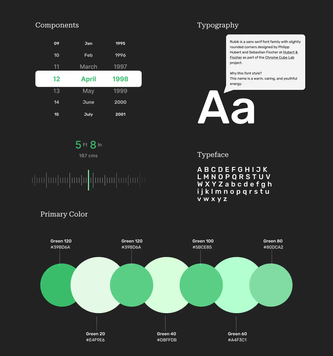
A pared-back token system — a calming palette, generous type scale and gentle motion — built to feel trustworthy to first-time internet users while carrying the warmth of a personal coach.
13
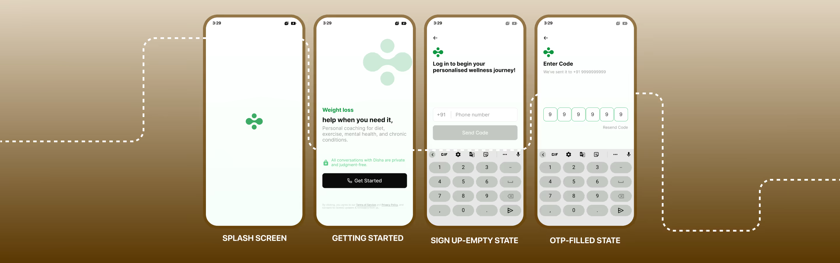
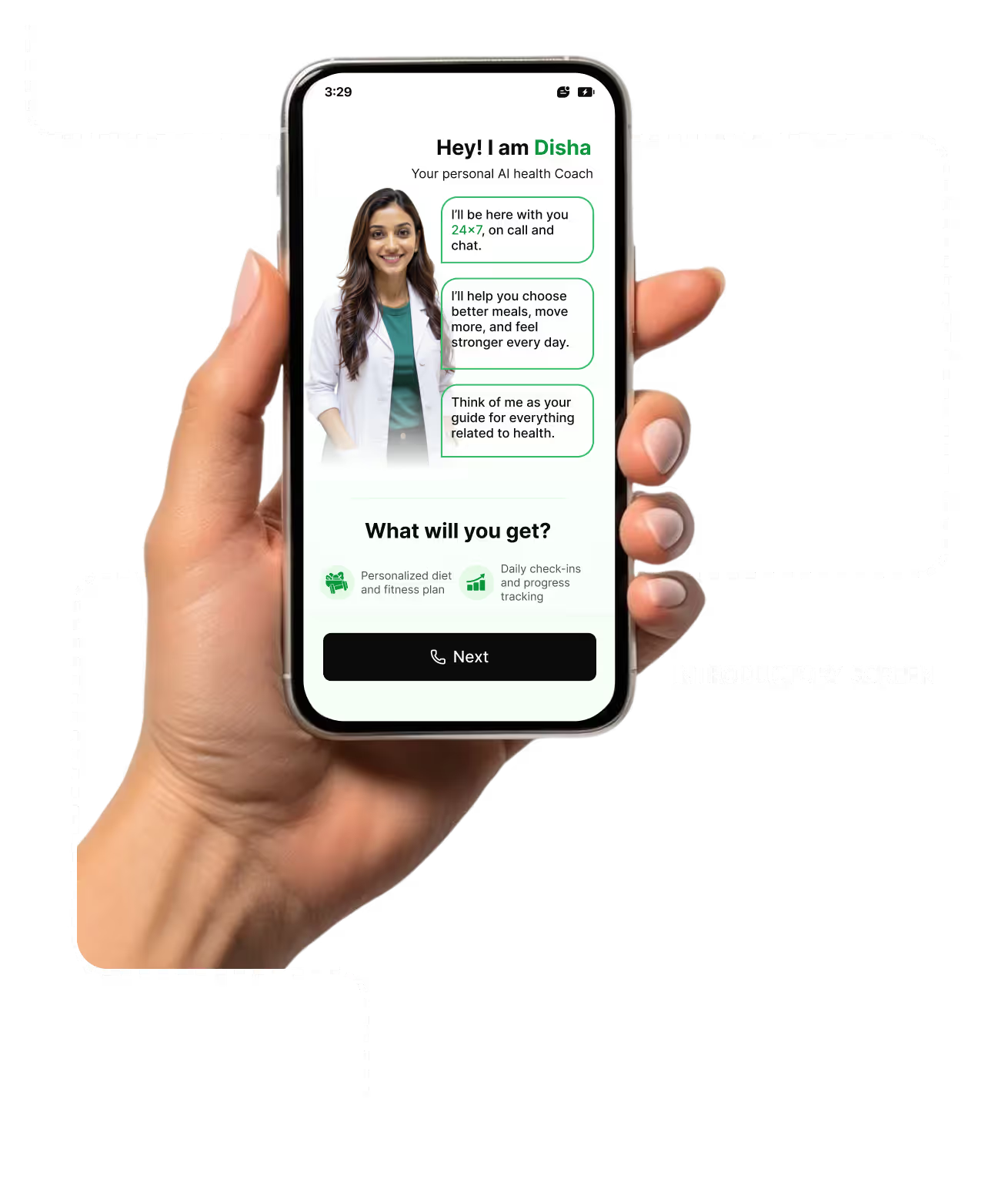
Login Screens
14
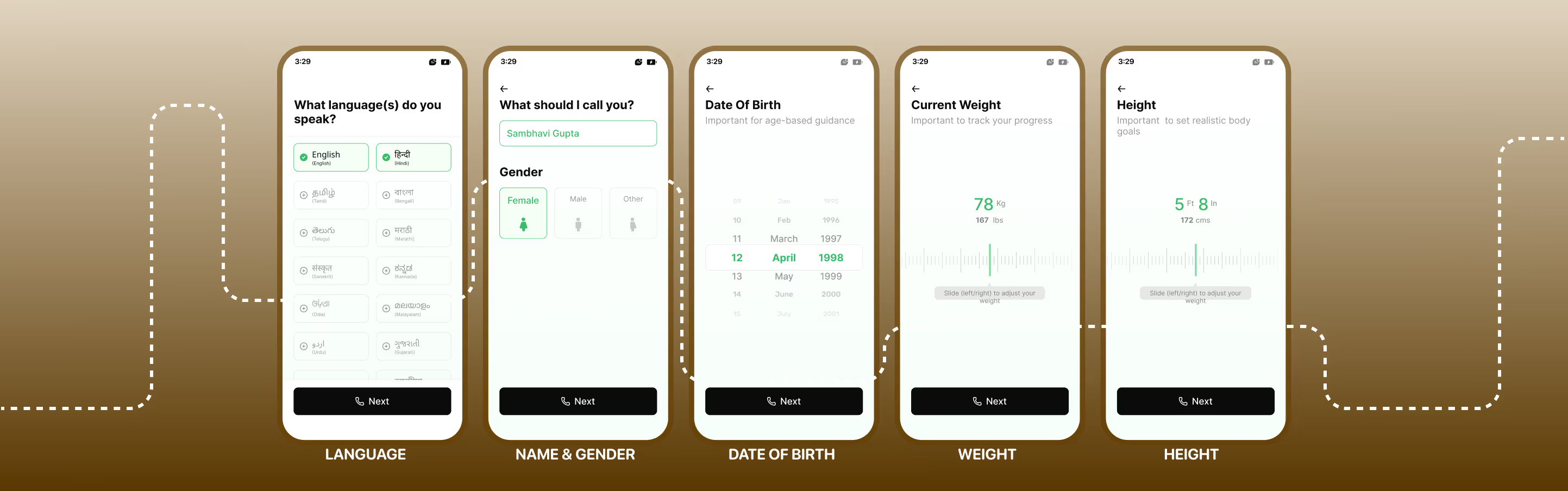
Onboarding Flow
15
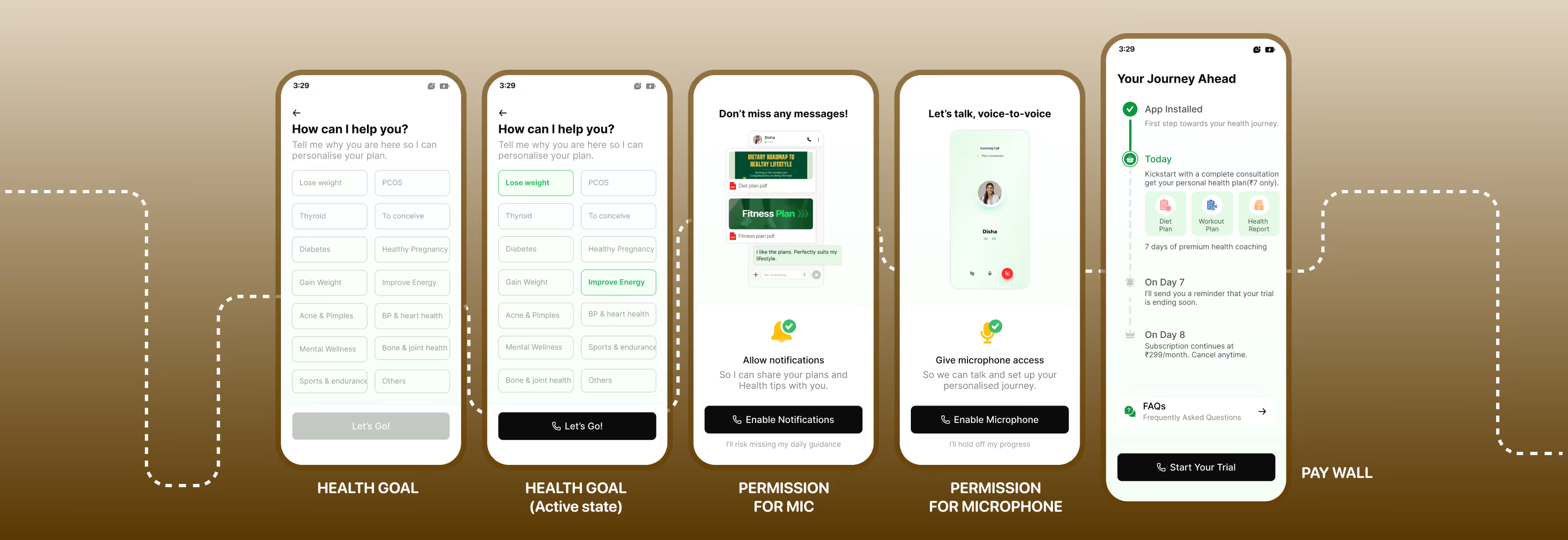
Health goals & Permissions
16
Payment & Sales call
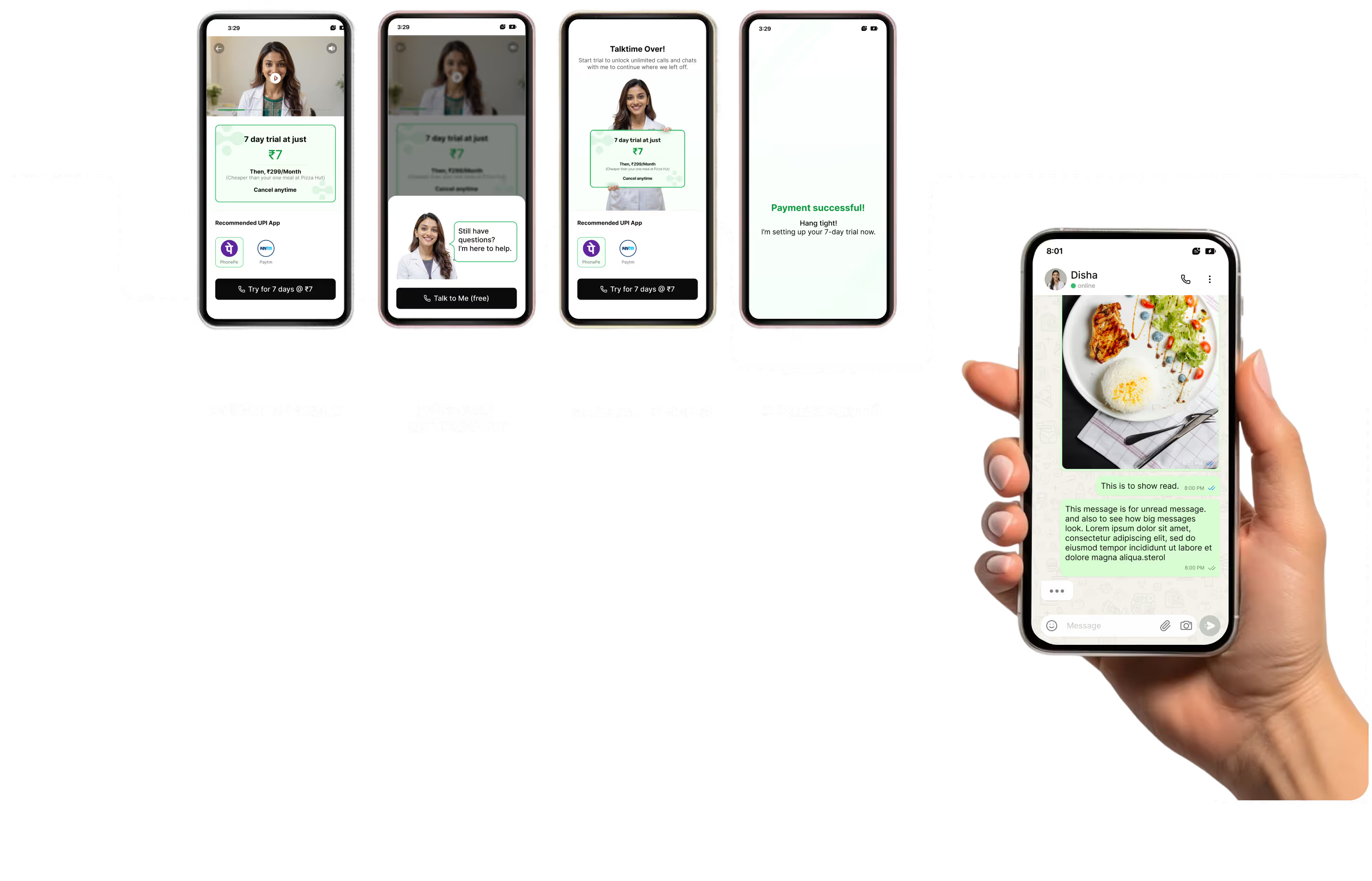
After onboarding, users are presented with a low-commitment ₹7 trial. The pricing is framed as affordable and risk-free, with clear cancellation messaging to reduce hesitation and build trust.
If the user exits the payment screen, a conversational bottom sheet appears offering a free call. Users who are unsure don't drop off — they receive assisted guidance before deciding.
Note: once past the paywall, users enter the chat experience. That specific screen wasn't part of the original design but is included to reflect the product's latest iteration and long-term vision.
17
Push Notifications
Users who don't proceed with the ₹7 paywall continue receiving push notifications. They maintain engagement and encourage reconsidering the subscription by highlighting daily AI coaching, health tracking and real user success stories.
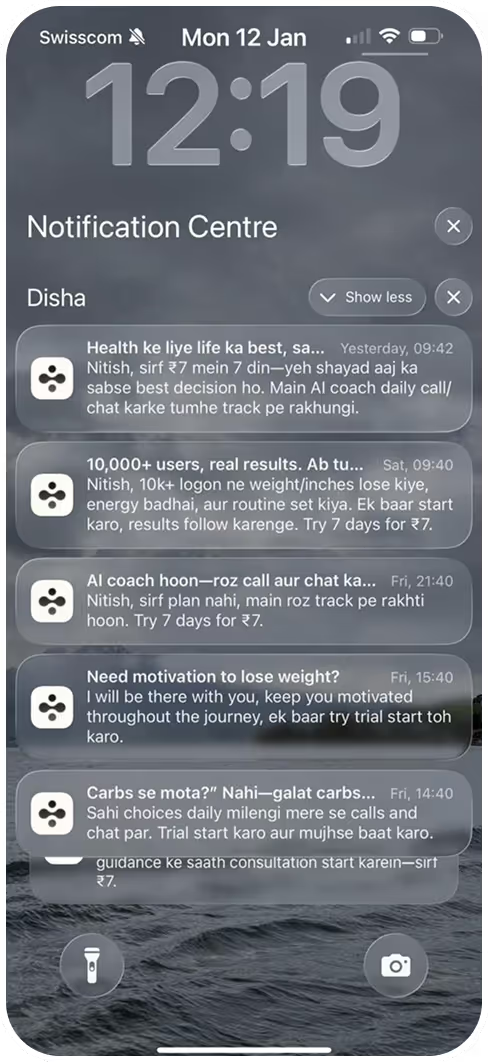
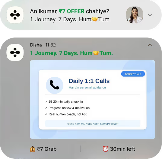
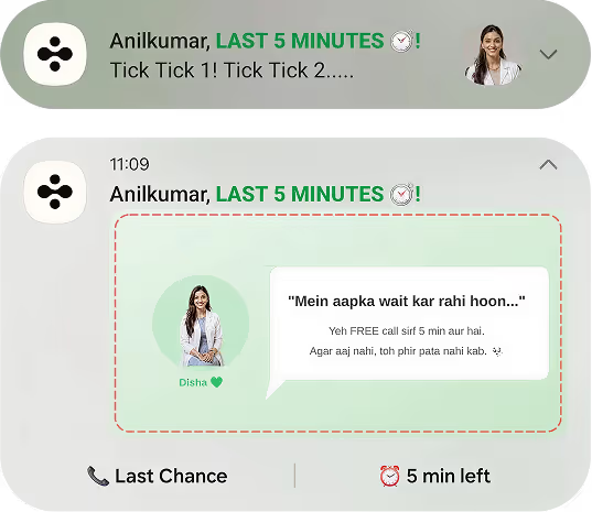
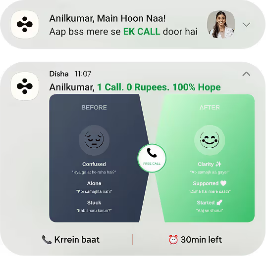
I designed a series of intuitive Android notifications to bridge the gap between high health intent and low habit formation — a ‘Supportive Navigator' using clear, proactive prompts that adapt to the user's day. Real-time nudges replace tracking fatigue so users stay consistent without feeling overwhelmed.
18
Onboarding Funnel Analysis
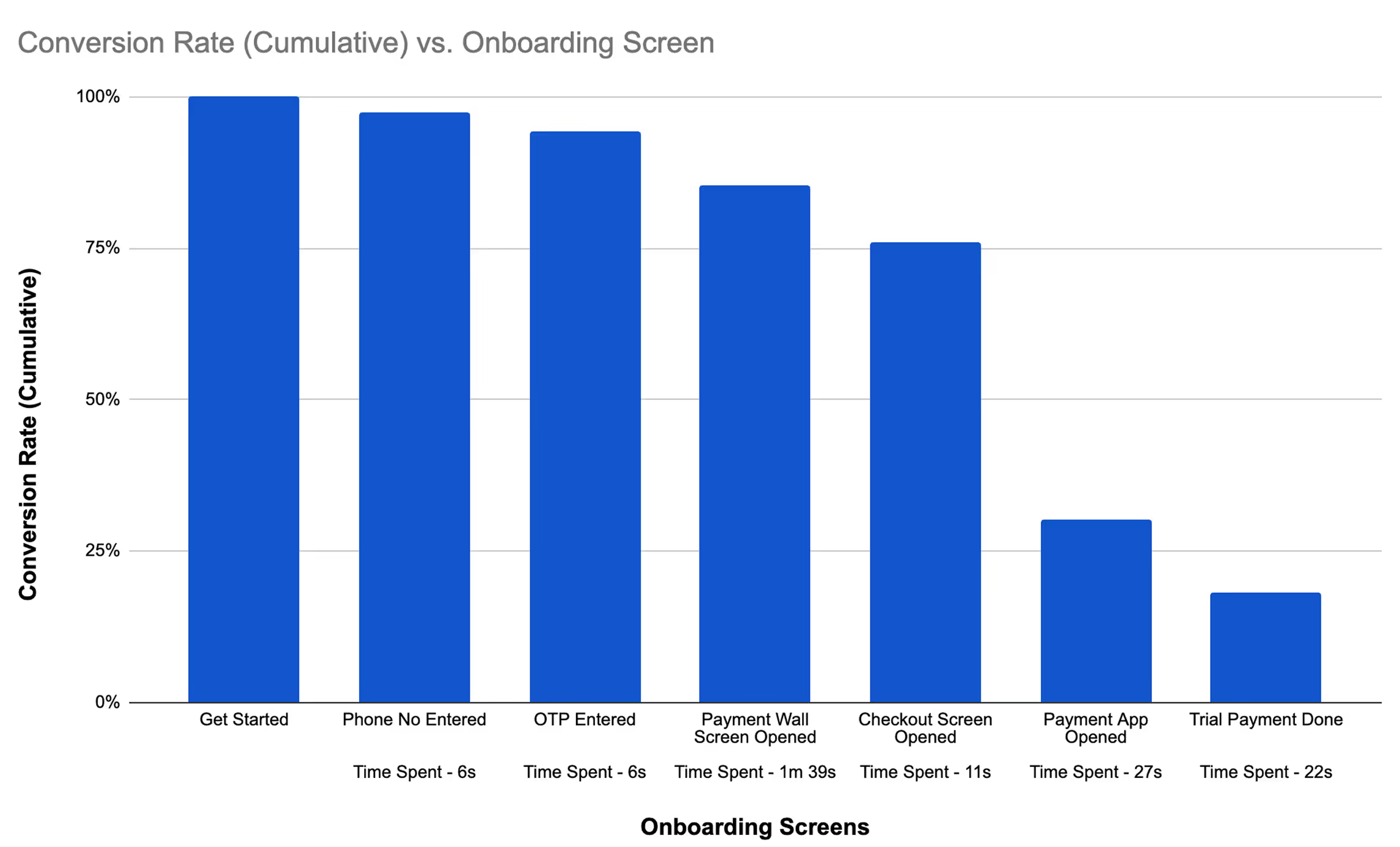
Through multiple rounds of A/B testing and design iterations, we refined the onboarding flow to a final conversion rate above 18%.
Excluding the inevitable drop-off when users switch to payment apps (Step 6), no screen experienced a drop-off greater than 10%. This proves the design successfully minimises cognitive load and builds trust with every step.
19
A/B Testing
As part of onboarding optimisation we brainstormed multiple approaches and ran experiments — one focused on the placement of the paywall.
In control (A), users saw the paywall early. In variant (B), the flow was redesigned so users completed onboarding first, with the paywall introduced at the final stage.
- 01Splash Screen
- 02Sign Up
- 03Introductory Screen
- 04Pay Wall
- 05Language
- 06Name & Gender
- 07Date of Birth
- 08Weight
- 09Height
- 01Splash Screen
- 02Sign Up
- 03Introductory Screen
- 04Language
- 05Name & Gender
- 06Date of Birth
- 07Weight
- 08Height
- 09Pay Wall
Highlighted — Paywall placement is the sole difference between the two tested flows.
Placing the paywall at the end of onboarding led to a +13.12% increase in ‘Sign up → Trial Purchase' — our key onboarding metric.
Users were more willing to continue once they had experienced the product's value before encountering the paywall.
20
Accessibility Considerations
- 01
Reducing cognitive load through a linear, chat-first experience that aligns with familiar WhatsApp interaction patterns.
- 02
Supporting linguistic diversity with multilingual onboarding and culturally relevant health recommendations.
- 03
Improving visual accessibility via high-contrast layouts, large tap targets, and minimal reliance on charts or numeric data.
- 04
Enabling voice-first interaction for users uncomfortable with typing or multitasking during daily routines.
- 05
Designing for emotional safety by avoiding shame-based feedback and framing health guidance as supportive coaching.
- 06
Lowering access barriers through OTP-based login and assisted sales calls for users struggling with digital payments.
21
Key Takeaways
- 01
Gained hands-on experience designing health-focused onboarding flows, ensuring sensitive data collection was empathetic, accessible, and compliant with user comfort and ethical UX standards.
- 02
Applied user-centered design principles to reduce cognitive load through simplified flows, progressive disclosure, clear CTAs, and structured hierarchy.
- 03
Collaborated cross-functionally with PMs, developers and health experts to align UX with technical feasibility, medical constraints, and business goals.
- 04
Iterated over 8–9 months using feedback loops, internal reviews and usability insights to optimise onboarding completion and quality.
- 05
Designed onboarding with a personalization-first approach, enabling AI-driven recommendations while staying conversational and human-centred.
- 06
Strengthened understanding of UX in health-tech: trust, accessibility, data transparency and long-term habit formation from the first interaction.
- 07
Developed skills in UX research synthesis — translating qualitative insight into actionable design within a real product environment.