02 / Case Study · Freelance Project · Built with AI Workflows
MainStreet. AI-curated local discovery, designed with AI workflows.
A freelance product design project exploring how AI can turn the scattered ritual of finding a good local spot — Google Maps for ratings, Instagram for vibe, TikTok for food, friends for a sanity check — into a single, predictive, journey-based discovery feed for busy people in Swiss cities.
Jump to Hi-fi Mocks- Role
- Product Designer (Freelance)
- Type
- Consumer · Discovery
- Platform
- iOS · Android
01
Design Foundations
Before starting any design, I focus on four things that keep the work honest and directional:
Problem Statement
The reason we're building — the friction we're removing from real people's days.
Target Audience
Who we're building for, in enough detail to make real trade-offs.
Surface
Where the experience lives, and where it explicitly does not.
Success Metrics
How we'll know it's working — for users and for the business.
02
Problem Statement
Finding the right local business is currently a mess — or doesn't happen at all. People bounce between Google Maps for ratings, Instagram to check the vibe, TikTok to see if the food looks good, and friends for recommendations — and still end up at places that don't match what they actually want. On the other side, local business owners struggle to reach their ideal customers and rarely connect with the audience they were built for.
03
Target Audience
Demographics
Young professionals, expats and students (Ages 22–36) living in urban Swiss areas — Zürich, Geneva, and similar.
Characteristics
Tech-savvy, values supporting local and independent businesses over major chains, has specific dietary or lifestyle preferences (vegan, specialty coffee, vintage fashion, etc.).
Pain Points
Limited free time. They hate wasting a weekend meal or an afternoon off on a mediocre experience because a generic review platform gave it 4.5 stars. They want a curated ‘vibe' that aligns with their lifestyle without spending an hour researching it.
04
Surface
Mobile apps (iOS & Android) are in scope. Web is explicitly out of scope — the core value depends on live location, passive route learning and glanceable, thumb-first interactions that only make sense on a phone in the user's hand.
05
Success Metrics
Time-to-Value
Feed Conversion Rate
Implicit Feedback
Explicit Feedback
Weekly Active Users
06
AI Tools · Prototyping
Where AI accelerated the visual head start, and where it fell short.
To kick off the visual process, I used AI generation tools to get a rapid head start. They provided a great baseline and surfaced ideas much faster than manual competitive analysis. But they couldn't be used as-is — each had core UX gaps that shaped the direction of the real design.
Lovable
AI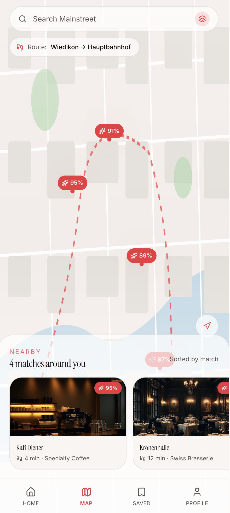
Map + carousel exploration
What worked
- Decent carousel showing matching scores alongside the map
Gaps
- Splits ‘Home' and ‘Map' into two tabs — introduces unnecessary friction
- Routing logic is flawed; unclear how the UI handles a plain ‘current location' state with no route
- Bright red on the map reads as traffic / warning — wrong signal for a premium, curated vibe
Figma Make
AI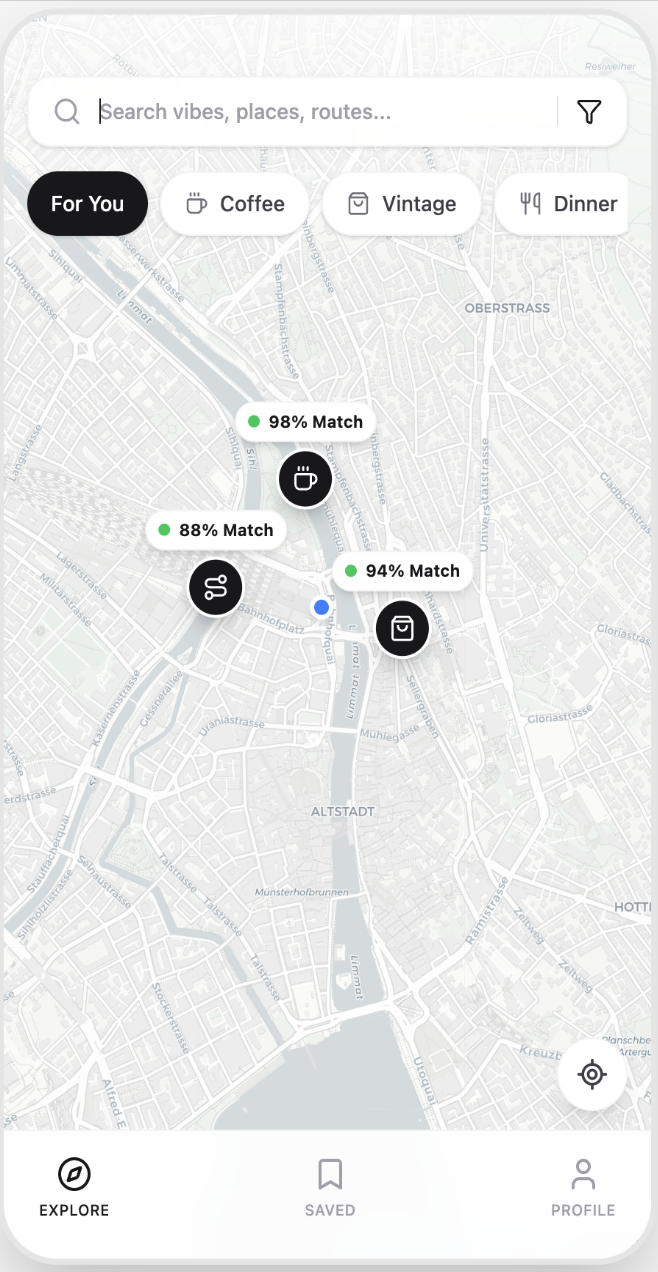
Rapid layout exploration
What worked
- Fast baseline styling
- Surfaces card and grid ideas quickly
Gaps
- No dedicated list view to actually browse personalized suggestions
- Context is broken — no clear signal of where the search is happening
- No way to add a route or differentiate it from a standard neighborhood search
Google Stitch
AI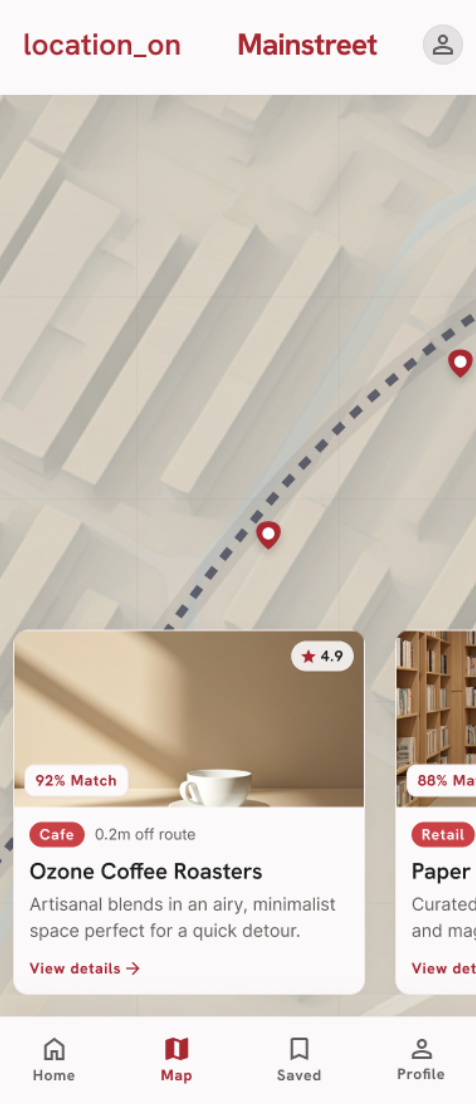
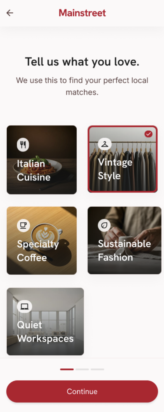
Onboarding & discovery structure
What worked
- Strong onboarding baseline — pictorial choices, one question per page
- Confirms the low-cognitive-load direction I was already thinking about
Gaps
- ‘location_on' header is vague and unhelpful
- No system for manually applying routes or surfacing learned ones
- Separates ‘Matches for You' from the Map — the exact split I chose to solve
07
Wireframing
Back to paper, to solve the structural flaws.
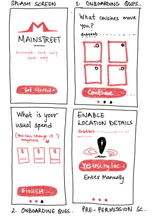
After identifying the structural flaws in the AI explorations, I stepped back and moved to paper. Onboarding was designed around a single question per screen with heavy use of visual graphics to drastically reduce cognitive load.
I also prioritised a dedicated ‘pre-permission' location screen. Because the app's value depends on tracking daily routes, it's critical to set the right tone and clearly explain the value exchange before triggering the OS-level permission prompt.
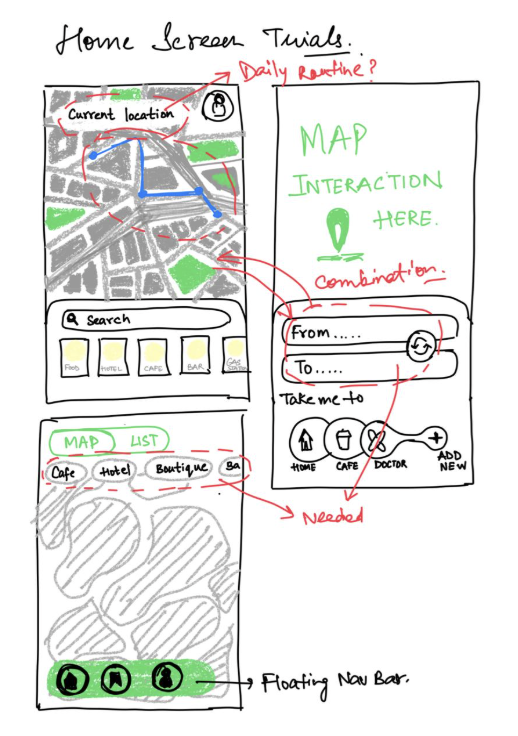
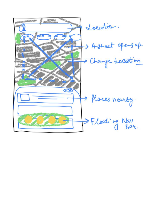
For the home screen, the challenge was seamlessly combining four complex elements: map interactions, routing logic, current location, and a personalised list of places with matching scores. I mapped out how users would intuitively add routes or apply quick filters like ‘Coffee' or ‘Dinner' without losing context.
08
Mocks for Onboarding
One question per screen, for both user and business flows.
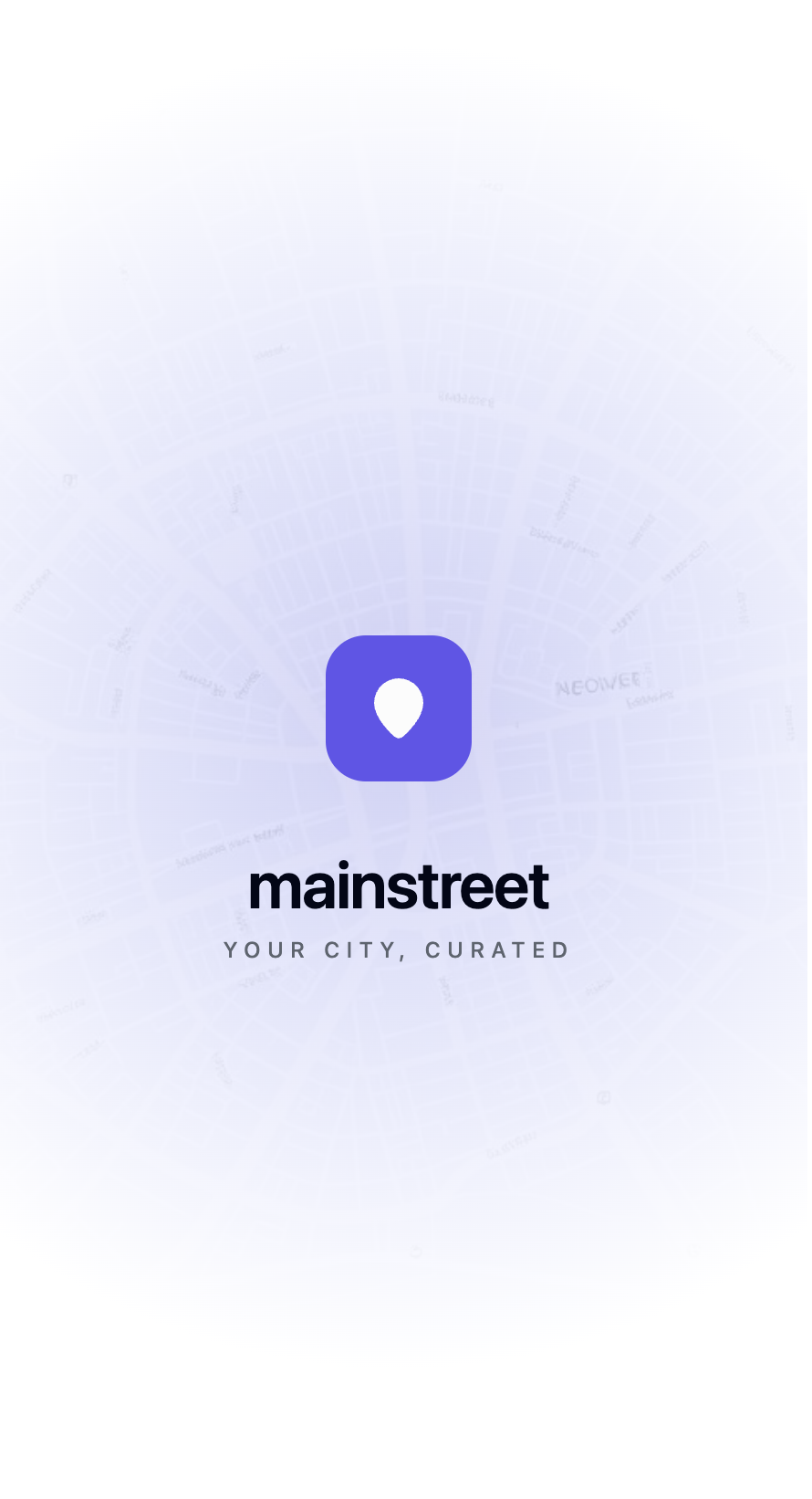
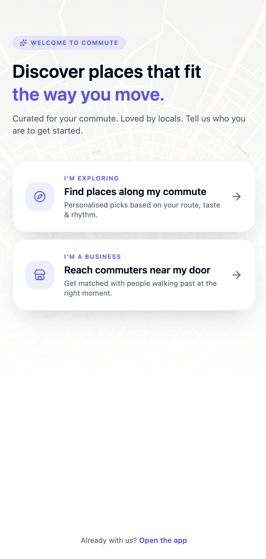
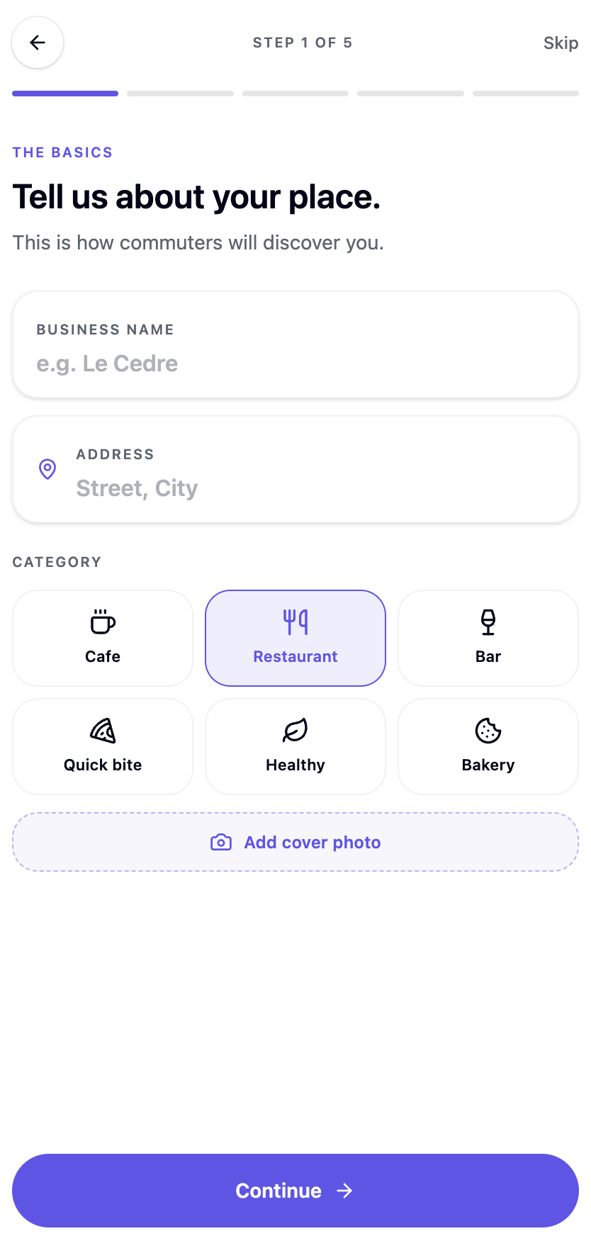
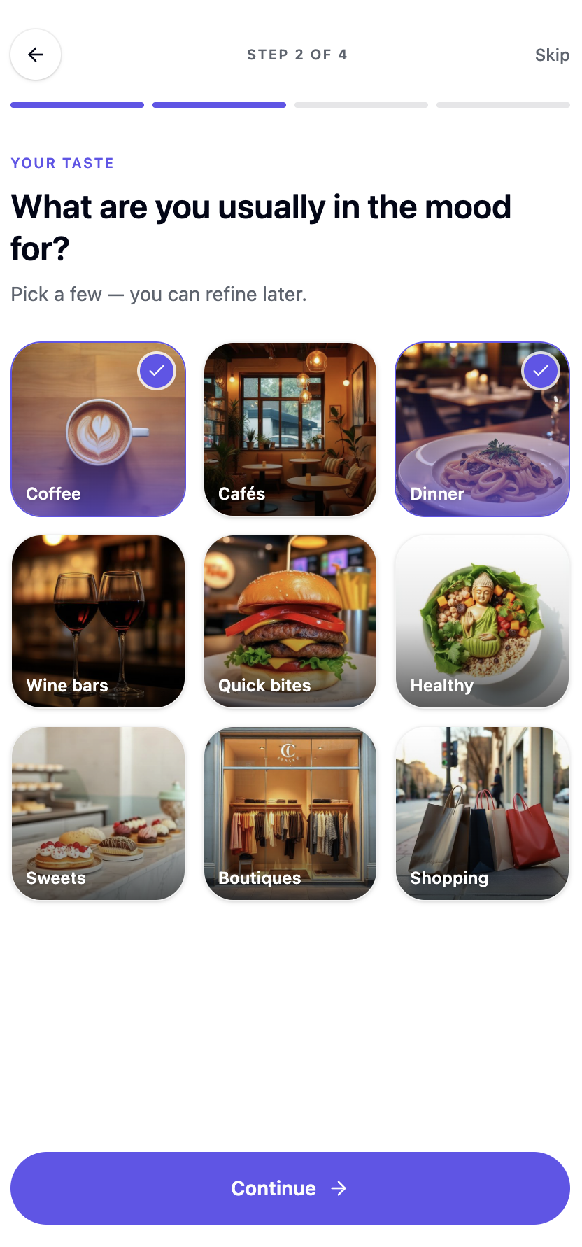
The onboarding screens are designed to hold one question per page — decreasing cognitive load and minimising time spent on any single screen. Separate onboarding flows exist for the business owner and the everyday user.
09
Hi-fi Mocks
The active ‘Exploring' state — before routing is applied.
From the wireframes, I developed a set of high-fidelity screens that walk through the core loop — from a plain ‘Exploring' state, to passive route detection, to the unified spatial controls that hold it all together.
01 · Hi-fi
Discovery — current location
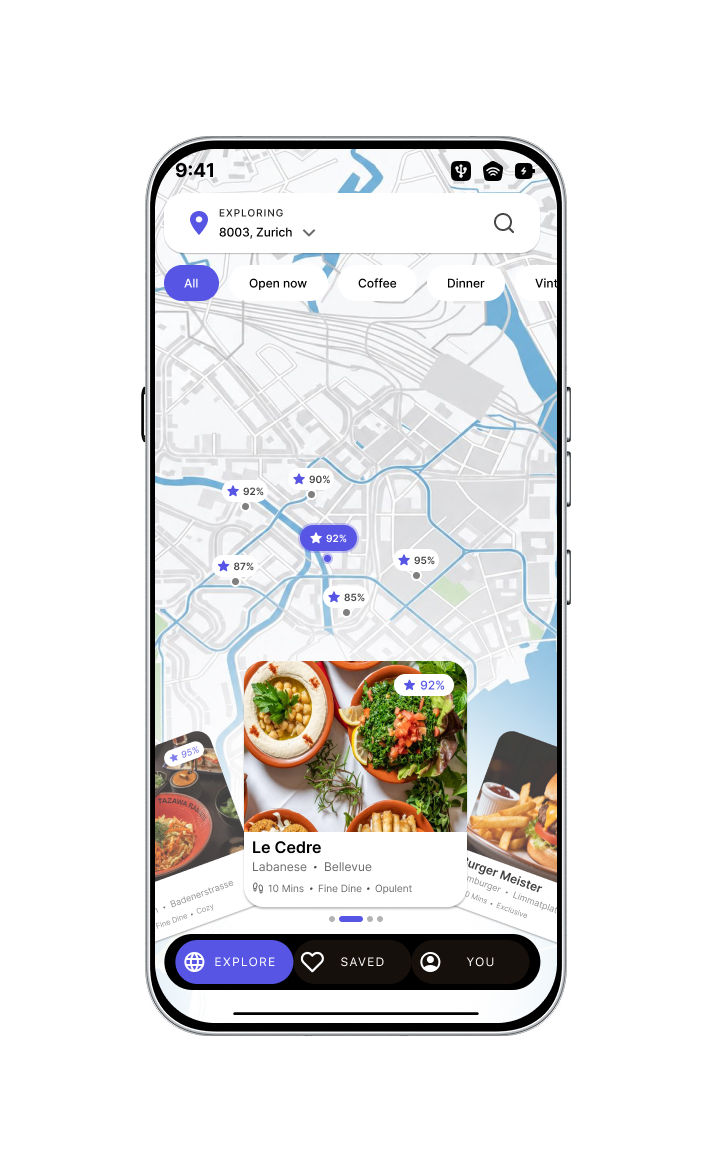
The default ‘Exploring' state stays fundamentally map-centric to preserve context, paired with low-friction quick-filter pills — ‘Open Now', ‘Coffee', ‘Dinner' — so users can rapidly narrow criteria without ever opening a separate search menu. The wheel carousel maximises each venue's visual aesthetic: walk time, a Smart Matching Score, and vibe tags like ‘opulent' or ‘cozy' answer is this my vibe? at a single glance.
02 · Hi-fi
Pattern detected — new route
MainStreet's true differentiator: predictive, journey-based curation. The system passively recognises a repeated route — Wiedikon → Zurich HB — and surfaces a subtle ‘Pattern Detected' banner, curating the sheet to matches along that path. It proves the intelligence without ever asking the user to configure it.
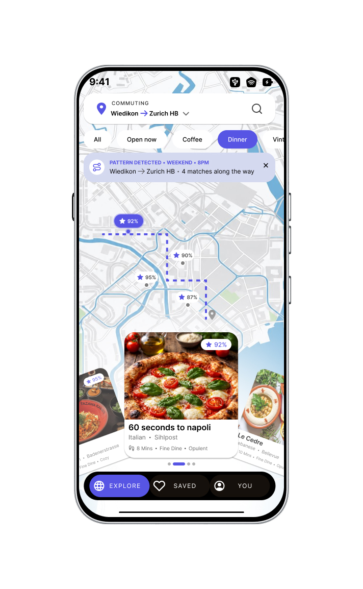
03 · Hi-fi
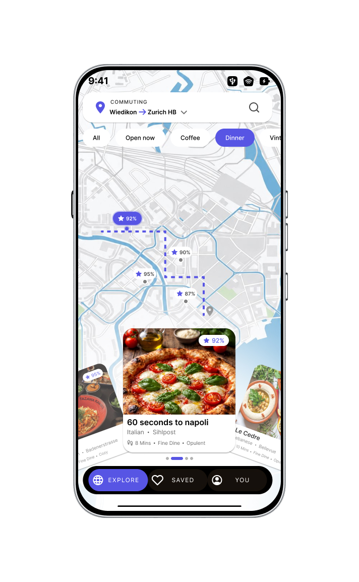
No banner — learned commute
Once acknowledged, the banner is dismissed and stays hidden for subsequent trips on the same route. Utility apps lose trust the moment they become noisy — showing the pattern once, then quietly curating in the background, is the detail that earns the second visit.
04 · Hi-fi
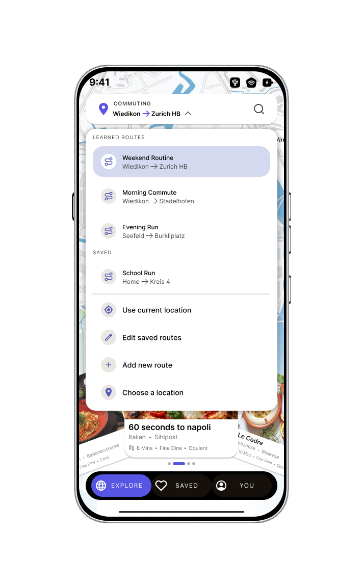
Unified location dropdown
The most important structural decision: all spatial controls live inside a single top-left menu — switching to a learned ‘Morning Commute', editing a saved route, or jumping to a new neighborhood. The top-left universally controls where the app is looking, so the bottom sheet is free to focus purely on what is there.
10
Alternative — Bottom Sheet List
Optimised for rapid scanning, closer to established habits.
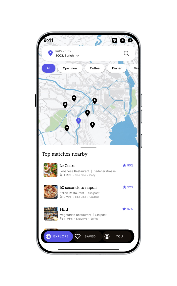
I also built an alternative mock using a standard bottom-sheet list. The wheel is optimised for a ‘focused decision' model — one premium recommendation at a time.
This alternative is designed for users who prioritise rapid scanning: it lets them cross-compare 4–5 highly-rated places simultaneously and leans on established mental models from apps like Google Maps.
11
Design Decisions — the Whys
Each decision maps back to trust, focus or premium feel.
The Unified Location Dropdown
All spatial controls — current location, learned routes, route editing — live inside a single top-left menu. The top-left corner dictates where the app is looking; the feed dictates what is there. It prevents routing features from getting buried in a Settings or Profile tab and keeps the mental model perfectly clean.
Contextual Header & One-Time Banner
The ‘Pattern Detected' banner appears only once, on initial route discovery, then hides for subsequent trips. Utility apps lose trust when they get noisy. Showing it once proves the intelligence without becoming annoying.
The Focused Immersive Wheel
Instead of a dense bottom-sheet list, a rotating wheel elevates one premium recommendation at a time. Highly tactile, differentiated from utilitarian map interfaces, and better suited to a time-poor user making a focused decision. Users swipe to spin and explore other curated options.
The Floating Navigation Bar
A decoupled, dark floating bar — not an edge-to-edge system tab bar. Maximises immersive map visibility when the sheet is closed, and anchors primary buttons within the thumb zone per Fitts's Law.
Matching Scores & Vibe Tags
Discovery cards lead with a specific match percentage (e.g. ‘95% Match'), walk time (‘4 mins') and short vibe tags (‘Fine Dine · Cozy', ‘Exclusive · Buffet'). The UI answers ‘Why is this for me?' before ‘How far is it?'.
Color Psychology — Indigo Ascent
Deliberately avoided red and green. Red reads as traffic / warning on a map; green makes it feel like a GPS clone. A deep blue-purple (indigo) is subtle but instantly signals a premium, curated matchmaking tool.
Accessibility
48×48px minimum tap targets, WCAG AA contrast, dynamic text sizing, VoiceOver support and color-independent affordances — built in, not bolted on.